

by Wren McMains
|
Sponsored Advertisements:
|
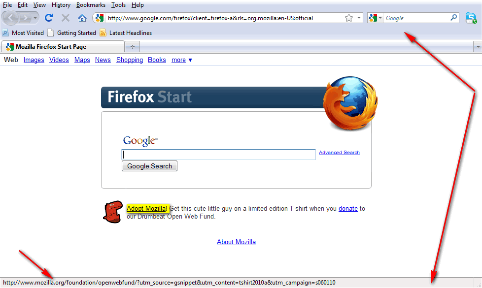
Toolbars are at the top, the Status Bar is at the bottom. As you move your cursor over a link (Adopt Mozilla!, above) the URL of the link appears in the Status Bar at the bottom. As far as I'm concerned this is one of the more important features of Firefox ... it keeps me from going unknown, rouge websites. You can turn off the Status Bar, but I recommend against that.
To add personas, choose Tools / Add-ons. Click on the Add-ons tab and type "personas":

Once you press "Enter" or click on the Search Glass, you'll see add-ons related to the word you typed. Click on "Personas Plus" which will highlight it:
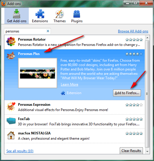
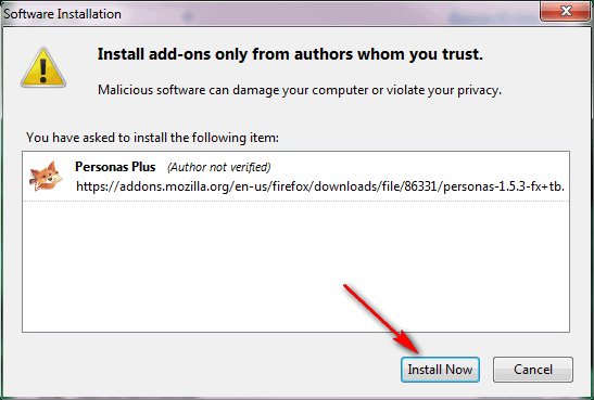
Then click on "Add to Firefox". Then when the "Install Now" button appears, click on it:
Before restarting Firefox, you may also want to install "Personas Expression", another choice shown above. Restart Firefox and you should see:
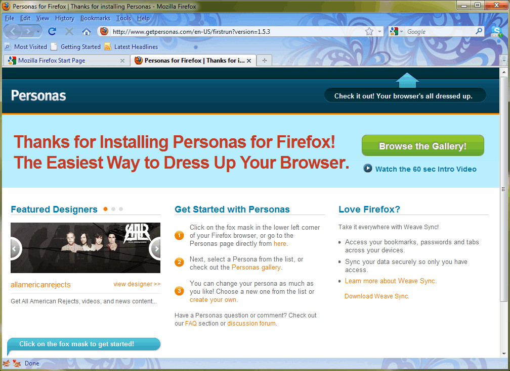
Note the design that's appeared under to Tool and Status Bars. Also note that little fox icons have appeared in the bottom left corner. The left one allows you to pick your Persona. The right one appears if you also installed Personas Expression which gives you more control over the look of the Persona. I recommend starting with "Most Popular":
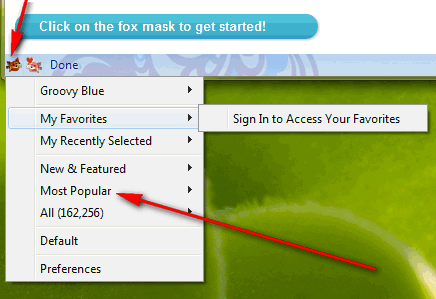
Which will give you a screen like the one below. If you move your mouse over any of the little previews, after a couple of seconds your browser will show you exactly what that persona will look like with your bars and window size:
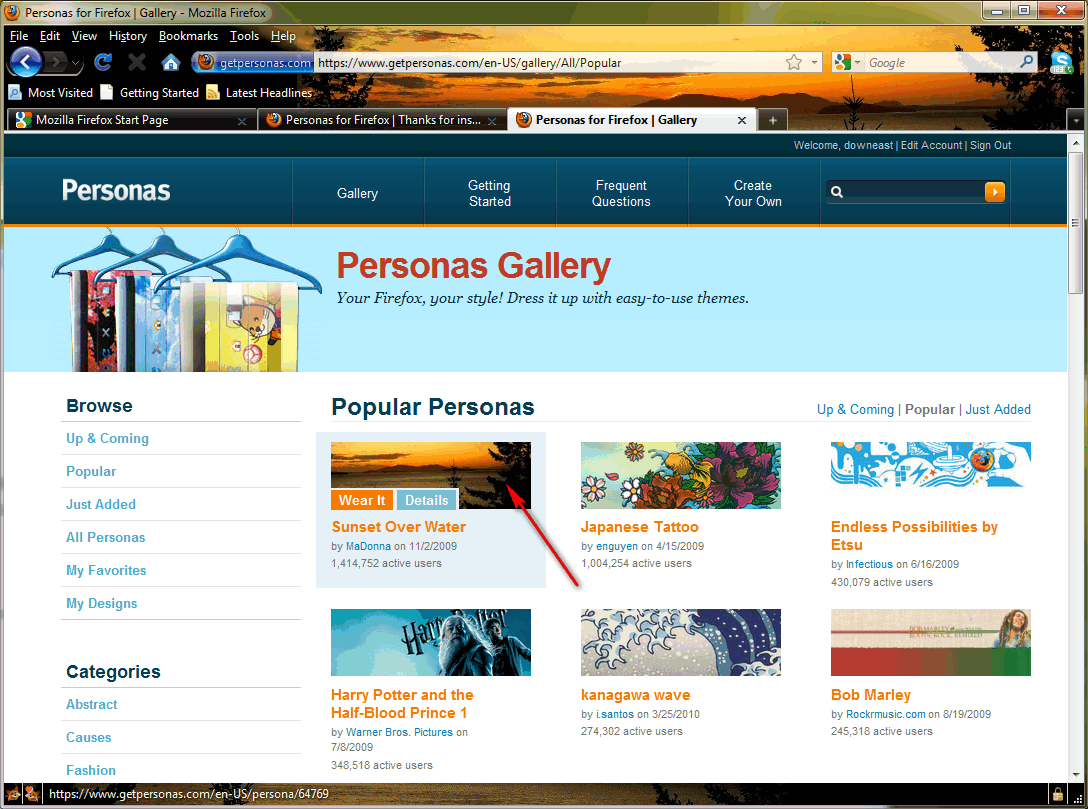
You can find more information about the Persona by clicking on "Details". To actually make that your Persona you need to click on "Wear It", otherwise it goes away after a few seconds.
Note that this Persona has changed the text color to white which shows up better in both the Menu and Status bars, and on the various Tabs and Buttons.
I recommend creating a Persona account right away because it allows you to identify your own favorite personas, and you're going to need an account when you create them. Click here:
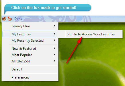
and then fill out this form:
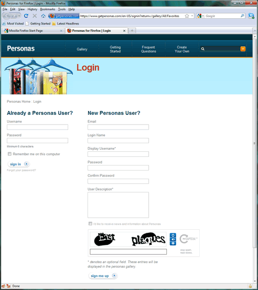
It's free, and as you see, you don't have to give them much information.
Spend some time looking at existing Personas, see what you think works well and what doesn't.
Since by default most users have the Menu, Navigation, and Bookmarks Bars open, you want to be careful about where the address (URL) and search boxes fall relative to your image because they block out that part of your image. Since the default placement of these is between 25 and 50 pixels from the top, keep key elements of your image away from that area. For example, if the image is a person, keep their eyes above or below that. Here's a popular Persona that was cropped so the eye is in the top 25 pixels:

Another good place to put key elements is over to the right. Many users don't have lots of tabs open and their row of bookmarks might not be full so the right side of the header is usually visible. That's were the face is placed in this one:

Here's an example of an image cropped so an eye appears both with and without the Menu Bar open:


When you submit your Persona, be sure to pick a text color that will show up well in contrast to both the background of your header and the bottom 25 or 50 pixels of your footer. Here's one where the eyes are above the address and search boxes, but the blue color chosen doesn't make the text very readable:

To create a persona, you need a "header" that is 3000 x 200 pixels and a "footer" that is 3000 x 100 pixels. With those dimensions most people immediately think panorama. Here's one that size (reduced to fit on this page) that you might think would make a good Persona:

Seems like a good place to start, but the problem is what one sees depends on their screen resolution and the width of the window the browser is running in. Someone with a window 1024 pixels wide would see just the portion outlined in red behind their toolbars:

That's probably not really what we wanted. The portion (height) of the header one sees behind the toolbars depends on the number of toolbars, the user has open. Personally I try to minimize the number. Each toolbar row is 25 pixels high. I normally have a Menu Bar, the Navigation Toolbar, and the Bookmarks Toolbar open. Therefore, when you add a row of Tabs you are using an area 100 pixels high by the width of the window from the upper right corner of the header. (Lots of things we install on our computer love to add Toolbars to our browser, so if you have more Toolbars shown, more of the 200 pixel hight of the header shows under the additional Toolbars.)
For the footer, the designer who choose this panorama might use either the bottom 100 pixels, or the 100 pixels just below the header (after resizing to 3000 pixels wide, but before cropping the header to 200 pixels high). The problem is that normally only one or two bars (each 25 pixels high) appear at the bottom of the screen so typically only the bottom 25 pixels of the footer on the LEFT side appear. With "Find" open, another bar appears so an area 50 pixels high appears.
If one used the same image for the footer, and "Find" was open, the area of the persona appearing at the bottom of the window is that shown in red:

OK, now that we see where in the header and footer the background comes from, what works well?
Your 200 pixel high image needs to tell a message in the top 100 pixels. The width isn't that important. Fill the rest of the header with a solid color, texture or subtle gradient that complements the image. The color of this background important because it makes text that ends up on top of it more readable, as long as you pick the right "text color". You don't want to use a multi-color background or a gradient that changes color too much; if you do text which overlays it will be hard to read.
Let's use this image of a tiger:
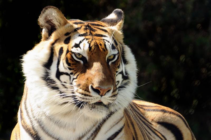
My first step is to crop out the strip that I want to use. Remember the emphasis should be on the top half of the image. The top eighth will be probably above the address bar, the next eighth behind the address and search boxes, and the next two eighths below them. Then I resize the image so that it is 200 pixels high:

Note that my crop put the tiger near the right edge of the image. Finally I extend the canvas so that the entire image is 3000 x 200 pixels. As I said, fill with a solid color, texture, or a subtle gradient. The object is to have a background which makes text readable:

If you're designing a Persona for yourself, you know how wide your windows usually are and can design accordingly. For everyone else you need to make it work well at a width of 1280 or even 1024. My recommendation is make the top 25 pixels close to the background color about 725 pixels from the right.
Ten years ago I designed websites for screens (windows) 800 pixels wide and made them work at 640. For some time I've recommended designing for windows 1024 wide, but I see many websites are designing for even greater width. For example, Facebook for 1280, the New York Times for 1240, CNN still uses 1024. Amazon and NewEgg work perfectly at 1024, but take advantage of the extra width if your window is wider. Gmail works at 1024, but to see the ads (which obviously they prefer you to see) you need a window 1280 pixels wide.
Here's the most popular Persona in a 1050 pixel wide window. Text is very readable. As you can see the top of the image starts to go black around 730 pixels from the right edge which is close to my recommendation. The large preview (shown below) on the "Details" page shows the right 1400 pixels of the header, as you can see everything to the left of about 800 pixels from the right edge is black.
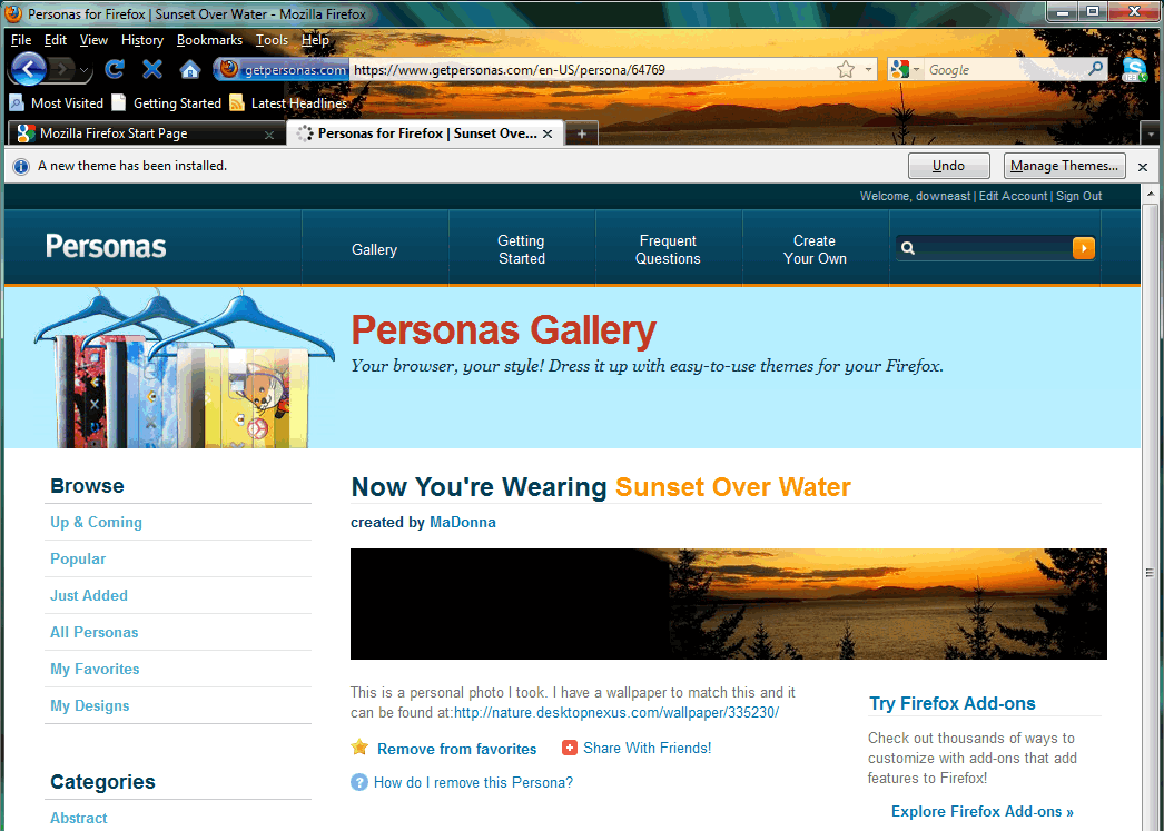
Note that for the footer (left side, bottom 50 pixels) MaDonna used the dark water reflecting the sunset, which with the white text makes anything over it VERY readable:

(The "grayed out" text will become white as soon as one starts typing in the search box.) Here's the second (currently) most popular persona:

The header works nicely with the black text, but I think the footer is really poorly designed. I can't read the domain of the link which is really important to me if I'm going to avoid rouge websites:
![]()
For my Tiger Persona, where I tried keep the eyes even below the Bookmark Toolbar, I picked a gold text color (hex ffcc66) to match the colors in the tiger; I think it works well on the black background.

When testing you have limited text colors, but when you submit a Persona you have full control over the text color. My recommendation is to experiment first in Photoshop (or your editor of choice) and know the hex value of the color you want. You're given a second color choice when submitting, the Accent Color. On a PC the only time it appears is for a second or two before a Persona loads when one mouses over a preview, on a MAC I believe it is used as the background for the top of the Window (which with Vista or Win 7 is now transparent).
You notice (above and below) that on my own Bookmarks Toolbar I have shorten the names (or in most cases removed them entirely so only the icons remain). As you can see this Toolbar is even more readable with more black background in the Persona below than over the tiger above.

One use of the footer is to add text that describes the Persona. If you do this keep your text in the bottom 25 pixels of the footer and start it about 500 pixels from the left to keep it away from the area in the Status Bar where the URL will appear when cursoring over a link. Here's an example with a Window about 1050 pixels wide:

If the lettering on the footer is close to the color of the background (as above), a contrasting text color will still show nicely over it:

And this will also allow the footer lettering to hide behind any buttons and icons in the bottom right corner when displayed in an 800 pixel wide window:

One last thing I've noticed. By default Firefox uses a drop shadow under text to try and make it readable when it is close to the color of the background. For example, here is white text on a white background:

If a find a Persona you like, but don't like the text color the designer choose, you can use the "Personas Expression" add-on to change the color of the text and the drop shadow and many other characteristics of a Persona.
When designing your Personas, be sure to test them before submitting, by using the "Edit" choice under Custom Persona:
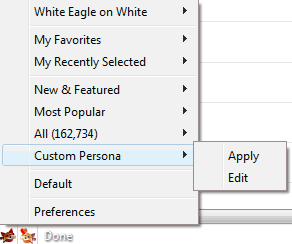
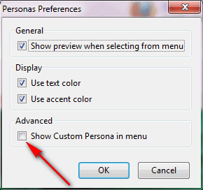
In order to make the "Custom Persona" choice appear on the menu choose Preferences (at bottom, above) and then check this box:
Once you submit your Persona, it takes awhile to get it approved. Usually a few hours, but if the queue gets really long it can take days. To make changes to your Persona, use the "Edit" choice under it (on your "My Designs" page) ... Edits get approved much quicker because the queue is shorter. When making edits you do not have to re-attach the header or footer if they haven't changed.
Well that's it for my tips, let's see your Persona designs.
Suggested next choices:
ImagingTips.com Site Map
[an error occurred while processing this directive]