

As many of you know, I've been using a Media Center Computer to power our 120 inch "TV" ever since a friend told me about Media Center eight years ago. Since March this computer has been running the Consumer Preview edition of Windows 8. This machine has two monitors: an HDMI projector (our 120" TV) and a touch screen next to my chair (this screen is a what I've heard some call a Windows 7 touch screen ... it's easy to swipe from the edges). I basically kept it in Desktop mode with the Media Center window on the projector and my Firefox browser open on the touch screen. The system was very stable since I was using a limited set of features. I've been happy enough with it to install Windows 8 on two more computers this week.
I fully embrace Microsoft's goal of a user interface that feels the same across a variety of platforms. For the most part they've done a great job. Windows 8 is not just for touch screens, it works really well on a laptop with a keyboard and touchpad, and not bad at all on a desktop with a keyboard and mouse or tablet.
On a scale of 1 to 10 I'm not yet sure what rating I'll give Windows 8, maybe it's appropriately named and gets an 8 :) I think it could be better, but it's growing on me. I know it will just get better as Microsoft releases updates and the Windows 8 Application developers learn to better use the live tiles and provide users more options, both in their applications and as to what's displayed on the it's live tile.
The big thing you see at first is a major change in the user interface which will take everyone a while to get use to. Instead of seeing your desktop and pressing the "Start Button" to start a program, you start by seeing the new "Start Screen" with "live tiles" that you press to start programs, which looked like this after a "fresh install":
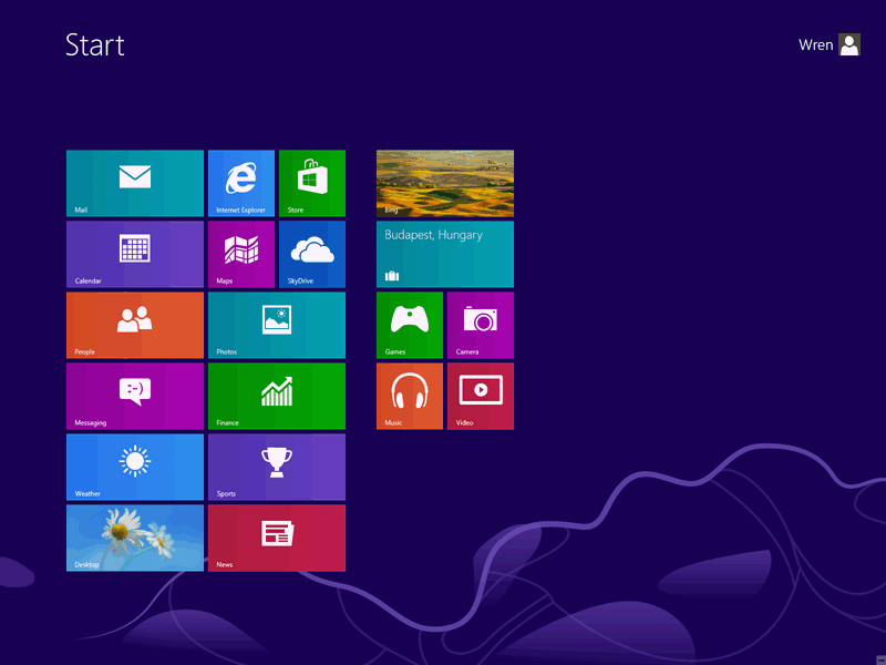
Here you see that only a couple of the tiles have started to update and turned into "live tiles" ... for the most part I've found that the tiles for Apps don't become live until after the first time you open the App. As you can see, this menu doesn't have many tiles, but personally I found many of them useless. The the discussion below of un-pinning and rearranging the tiles.
Speaking of the user interface (UI), for the last year Microsoft was calling it the Metro, or Modern, interface and all the new applications that ran in that new world they called Metro Apps. However, a couple of months ago, claiming legal problems over the name, Microsoft dropped the Metro name and after a month or so of confusion about what they would call it, now Microsoft seems to call it the "Windows 8 UI" (which I'll call the W8 UI) and the applications "Windows 8 Apps" (which I'll call W8 Apps). Some Apps come in two versions, for example Internet Explorer, which comes in both a W8 version and a version which runs on the Desktop. Since even Microsoft employees didn't know what to call things, some reviewers started referring to the new style version of Internet Explorer, as the "It's not called Metro version"
Below I talk about features I like, features that have disappeared, minor annoyances, and tips for configuring, but here's my recommendation to everyone:
Until January 31, 2013 it only costs $40 to upgrade to Windows 8 Professional (even if you only have the Home Premium version of Vista, Windows 7 or even XP). That's a great deal! If you have the room to create a new partition, 80-120 GB or more, I recommend without hesitation buying the upgrade and doing a "fresh install" in the empty partition. This will automatically add a dual boot startup that lets you choose to run Windows 8 OR your older version of Windows.
Even if you don't have room to create the partition, you might want to buy the upgrade but hold off on installing it until you're ready to spend the time learning to use the new interface. Be sure to also get the Key for the free Media Center addition before January 31st.
Updated 12/02/2012: Click here for directions on buying the upgrade, re-partitioning your drive, and doing the install.
Updated 12/15/2012: After you install Windows 8 here are my Tips for Setting Up Windows 8.
The "fresh install" works especially well on a machine with two hard drives. You can put all your documents, pictures, etc. on the second drive and access them from either Win 8 or your old version. Since almost every machine I build for friends is configured with all the data on a second drive, it's really easy to add Windows 8 to these machines. (For years I've recommended keeping only programs on the system drive, making it quick to backup the entire drive using a stand-alone program.)
You can probably put Windows 8 on the second drive, but personally I haven't tried that. Even if you don't have two drives, it is possible to convince Win 8 that your documents, pictures, etc. are really on the partition with the old version of Windows.
With Vista and Windows 7, I almost always recommended the Home Premium version. It had all the features most users needed. The Home Premium (or Basic) version of Windows 8 no longer comes with Media Center. You can add a package that upgrades Home Premium (Basic) to Professional and adds Media Center. Or if you start with Windows 8 Professional, Microsoft is giving you Media Center for free as long as you get the key to unlock Media Center before January 31st.
I've just ordered a new Laptop which I expect to arrive next week. It comes with Windows 7 installed, but with a free upgrade to Windows 8. When it comes I do screen captures of the partitioning process and either do the fresh install in Computer Class, or at least take pictures of the screen during the install process.
The bottom line is that the more I use Windows 8, the better I like it. Once you install Windows 8, be sure to print my Windows 8 Shortcuts. They're very useful, especially if you're using a mouse instead of touch screen or laptop touchpad.
Everything I've read says Windows 8 is faster than any previous version of Windows on the same hardware. And it's especially faster when it comes to the time it takes to boot. I have no statistics of my own, but it certainly seems faster (and a machine has to be a LOT faster to actually notice a difference) ... of course every machine always seems faster after a fresh install.
With Windows 7, once we figured it out we thought the search feature was great! Press the start button, a little search box appeared just above it. Click in the box and start typing and it would find programs, files starting with those characters, or even words inside files starting with whatever you typed ... and it was so fast.
Windows 8 has a search icon on the charms bar (see below), but the real secret is you don't have to do anything except start typing. Nothing to push, no box to put the cursor in, just start typing and it knows what you want. If you're looking at the Start Menu, it defaults to finding an App or Program starting with those characters. If you're in an App it defaults to whatever makes sense there, etc. At first this was one of the things that really bugged me about Windows 8 Apps ... the first one I tried where one of the obvious things you wanted to do was search had no search box! This was the Wikipedia App ... obviously unless you wanted to read a random featured story of the day the first thing anyone would want to do was search. I poked around, seemingly for minutes, trying to find a search button and getting more frustrated. Finally discovered I had to go to the charms bar, click on the search icon and then start typing in the box. Seemed silly, especially with a mouse where the charm bar was a bit difficult to coax out. Little did I realize none of this was needed. Start Wikipedia, start typing a couple of letters and it gives you choices. How easy is that? Much better than Windows 7!
The "Store" is another place that drove me crazy. How could you find anything if you didn't know what category it was in. Took me forever to realize you just starting typing the name.
The switch list is a bar on the left side of the screen and shows the W8 Apps that are running, with the one you've used most recently on top. It looks like this:
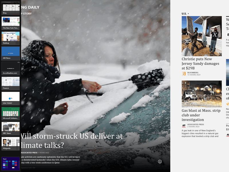
With a mouse you coax it out like you do the Charms on the right: go to the top of bottom corner, and then staying along the left edge move down from the top (or up from the bottom until it appears). It's a great way to switch directly to the App you want, just click on it. If you right click on an App in the list you'll have the opportunity to "snap" it to the right or left side of the display or to close it. Snapping it to a side lets you see two W8 Apps side by side by side, here's an example:
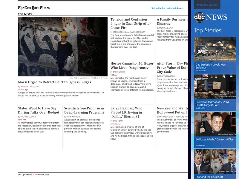
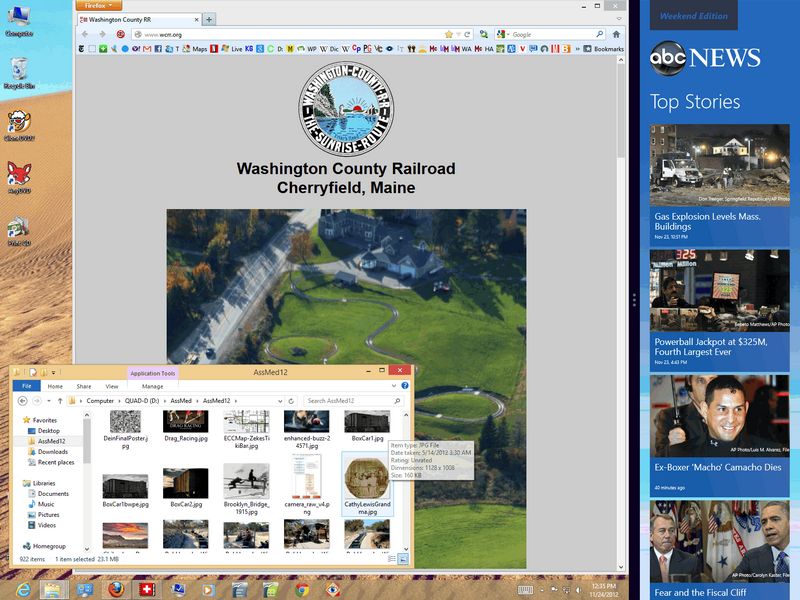
But's there's no reason your Desktop can't be in the other window, leaving a W8 App running in the column on the right:
If you swipe out from the right edge of the screen, use the WinKey + C shortcut, or with a mouse go to the top or bottom right corner and then while staying along the edge move the cursor down (or up from the bottom) the Charms Bar appears. It looks like this:
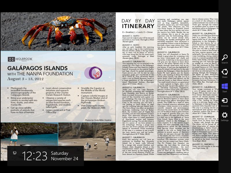
And as you see a the date and time are also displayed. This is where you access: Search, Share, Start, Devices and Settings. Required for printing from some W8 Apps, but on the whole I'm not convinced about the usefulness of this on a desktop or traditional laptop machine, see below.
Most W8 Apps also have their own App Bars at the top and/or bottom of the screen. These are easy to expose with a swipe in from the top or bottom, with the WinKey + Z shortcut, and in theory a right click of the mouse in a blank area of the App. I've found this doesn't always work; you'll have better luck if you right click at the top of the screen, but the cursor becomes a circle ... if you then do some tricky dribble with the that circle (bounce it off the top edge, pull down, then reverse and move up, or something) until the App Bar(s) appear.
If the App is properly designed the Top Bar allows you to navigate the App, the Bottom Bar has options for the App. Here's an example of the Bars in the NY Times App:
Much better support for touch screens. Windows 7 supported touch screens, but Windows 8 does an even better job. Not just through the new Windows 8 User Interface, but also on the Desktop.
Microsoft is talking about all the new Windows 8 (Metro) Apps, but being primarily a desktop user I really appreciate all the improvements in the Desktop Interface.
The "File Explorer" tile on the Start Menu takes you to the Desktop Interface and opens what use to be called Windows Explorer, showing you the Libraries view of your data. The "Computer" tile does the same thing, but shows you a view starting with each drive ... because I have over a dozen drives, both local and network, this is the view I prefer. The shortcut to get here is the WinKey+E, the same as it was in Windows 7.
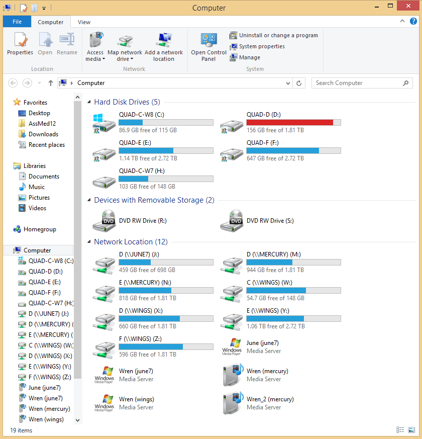
The big addition (in both these views) is the Ribbon across the top, much like the ribbons that have been in last few versions of Microsoft Office. Since I haven't used MS Office in years, I wasn't convinced about these ribbons, but now I am. The File Explorer ribbons are REALLY useful. Because I have LOTS of hard drives on my machines, I prefer to start File Explorer in the "Computer View". You can get to this view from the Computer App on the new Start Menu, by clicking on the computer icon on your desktop (which you can add by ...), or I like to add this "Computer Shortcut" to my Task Bar (download to your desktop, then drag to where you want it on the Task Bar). Download by clicking on the words Computer Shortcut.
Just to give you a sense of what's on some of these ribbons, here's what the ribbon for the Home tab looks like when you're viewing the contents of a folder:
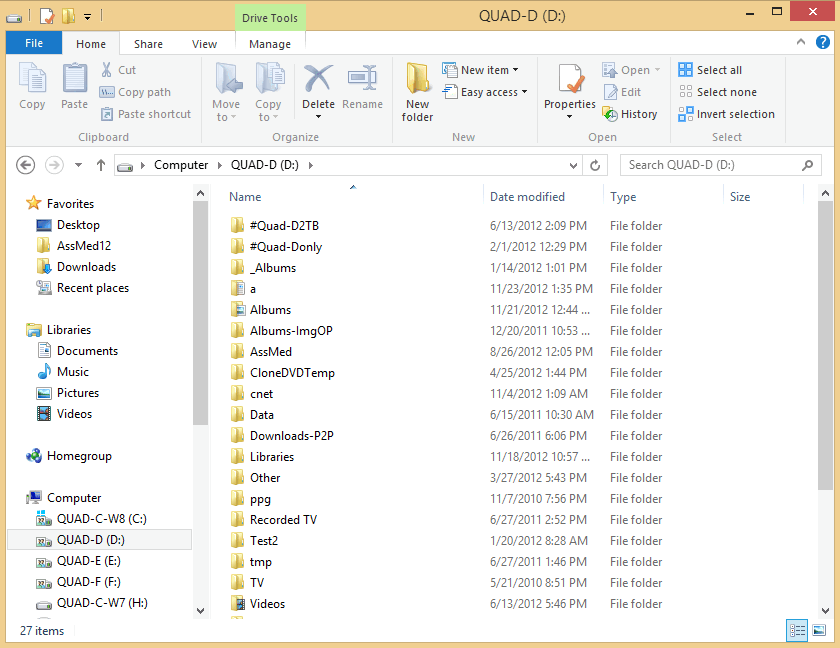
Down the left side (the folder pane) nothing much has changes, you still have Favorites which is VERY useful once you start adding your own. Here I've only added one folder, I'll add more as I start to use the machine. Next are all the options you have if you click on the "Share" tab:

I like to treat the dozen or so drives on all my machines as all part of whatever machine I'm currently using, so I share drives at the root, or top, level; but many people only share a particular folders (and any folders under it). Next we see the options on the "View" tab:

Everything is so easy to see and access. Notice all the little downward pointing triangles, which can be opened for even more options. Next is ribbon that appears if you choose the "Manage" tab:

The ribbons are great, but also note the little arrow in the top right, next to the question mark. Here it points up and if you click on it the ribbon disappears leaving more room to display the contents of the folder. The arrow then points down, and click on the down arrow restores the ribbon.
Another neat feature is what happens if you press the Alt Key (to access shortcuts for the menu). As you can see on this "Home" tab ribbon little Tool Tips appear to remind you of all the shortcuts currently available:

And finally, here's what appears if you choose the "File" tab:
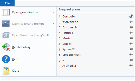
Notice how easy it is to pin folders you use frequently to the list on the right.
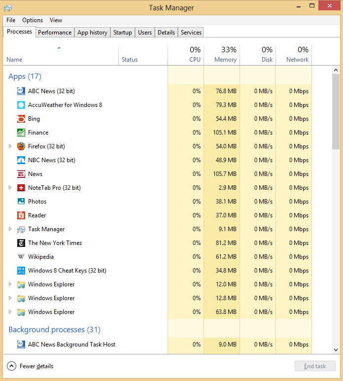
I know most of you only visit the Task Manager to kill a process that has become unresponsive, but the Windows 8 version has all kinds of new features:
A seemingly small improvement, but one I really like is the dialog box that shows you the status when copying or moving files. You use to see something like this:
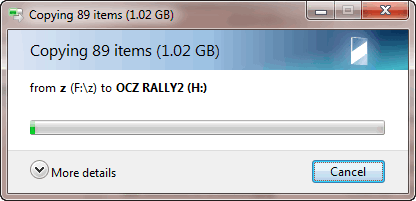
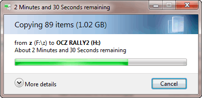
It told you how many files it was going to copy, the total size, and after a while how much longer it was going to take. After that there was no feedback except for an occasional update on how long was left.
The new dialog box looks like this:
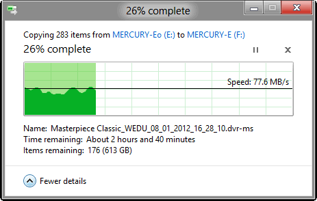
Not only does it tell you how many what it needs to copy, but it keeps you updated on how many files (items) remain to be copied and their total size, and even the name of the file it's currently copying. It also reports the speed at which the files are currently moving and gives you a graph showing how the speed has varied over time. (Here I was copying almost a terabyte of data, there weren't that many files, but each was VERY big.)
[OK, I admit, Windows 7 did show you the other details if you clicked on "More Details", only the graph is new. The difference is that Windows 8 remembers your preference. If you choose "More Details" it shows you the graph and details EVERY time you copy folders or anything that takes a enough time for the dialog box to appear. That's why I didn't realize Windows 8 didn't ALWAYS show you the graph and other details. I wasn't until I started using another system that I realized the default was less details.]
Microsoft has followed the Apple and Google Android model, W8 Apps are "purchased" from the Microsoft store. The "Store" is one of the tiles you find on the Start Screen when you first install Windows 8.
There are a couple things I like about the Store: Unlike Apple, you don't have to provide a credit card to purchase Apps which are free. And the Store remembers Apps you have "purchased" so it's easy to install them on a second computer.
The limit is that you can only install an App on 5 machines. Once I purchase Apps that I actually pay for I'm going to have to learn if/how one can return a license to the Store so I can then reinstall on machine up north (both my wife and I have multiple machine in two homes so the limit of 5 becomes a problem unless we can move the license back and forth.
At some point (during the summer of 2012?) Microsoft admitted to a security problem with gadgets, and suggested turning off the Sidebar which controls them. Instead of fixing the problem, I think Microsoft used it as an excuse to remove Gadgets from Windows 8. I believe their thinking was that live tiles provided the same function and this would help encourage you to learn to love the new Start Menu. They're not the same at all! On my desktop machine I have about 5 square FEET of space (on two 27" monitors) for various programs running in different windows and several gadgets which are usually visible (sometimes they get covered by other windows, but usually not). These gadgets are things I want to be able to see at a glance.
Many of the "Aero" features from Windows 7 seem to have disappeared: Translucent window edges and bars, flipping through live views of open windows using the Win+Tab keys, the "Peek" or "Show Desktop button in the bottom right of the screen is no longer shown, but still works if you click "near" the bottom right (the shortcut is WinKey+D). These were all neat, but their loss is no big deal. The full-size live view of a window (by pointing to a thumbnail shown by clicking on a taskbar icon) and the "shake" feature which closes all other windows are still there. They're both very useful.
The Games that came with EVERY prior version of Windows, the ones that run of the Desktop, have all disappeared. Sure, you can get W8 Apps from the store that give you almost the same games, but they don't run on your desktop. The W8 App versions are fine on many screens, but if you have 24, 27 or 30" monitors like I do many are TOO BIG. This is called Windows for a reason, I should be able to resize the Window and have lots of them on one screen.
The Win+Tab keys now take you through thumbnails of the open W8 Apps, but not the large live view. The Alt+Tab keys take you through thumbnails of all open programs, both W8 Apps and those running on the desktop. It does show you a live view of the window under the thumbnails. I haven't found a way to just cycle through those programs running on the desktop.
Added 12/01/2012: They didn't really disappear, it's just that they are turned off and it's very difficult to guess where you need to go to turn them back on. Here's one example: In Windows Explorer (now File Explorer) if you have a folder highlighted and press the Delete key that folder and all the others under it are deleted with warning ... you might not even know you've done it. To turn the warning dialog back on: right-click on the Recycle Bin, choose Properties, and check the box that says "Display delete confirmation dialog":
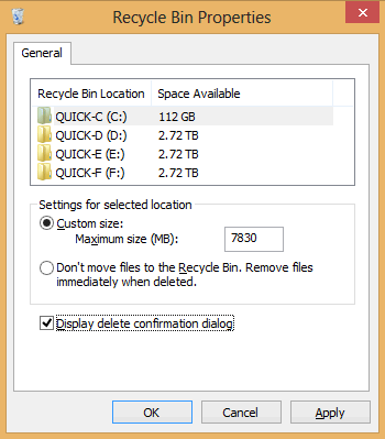
Personally I think this should be the default.
For most of you the biggest annoyance will be learning the new "and better" way to access almost everything. We've seen things move from where we expect them to some new place in almost every new version of Windows, it's just that there seems to be so much more to learn this time. Once we get use to how to do things in a new version, it's almost always better. Once we get use to Windows 8, we'll probably wonder how anyone ever found anything in the older versions.
In Vista and Windows 7 the Start Menu organized itself based on which programs YOU used. In Windows 8 it's very important that you organize the Start Menu yourself. Be sure the things you use the most appear on the Start Menu screen without scrolling. You just slide the tiles around, putting them in groups that make sense to you. You can even name the groups.
In the left-most group I put the programs I use the most, both W8 Apps and Desktop programs. In the next group I've put W8 Apps that I like which provide me with news, weather, and other things of interest to me ... here the live tiles can provide useful information.
In the next group I've put all the Apps for programs that I've installed ... all old desktop programs that put things on the start menu now add them to the last group on the start menu, so maybe you want to keep this group last.
Another group are Apps that I might be interested in, but haven't really decided. I recommend "un-pinning" any App you try and don't think you'll use again for a while from the Start Menu ... they're easy to add back, and the less tiles you have the easier it is to find the useful ones. If you do a "fresh install" of Windows, Microsoft will add a lot of tiles that probably won't interest you ... don't be afraid to un-pin them. If you buy a new computer, the manufacturer will add a LOT of tiles ... many (most?) won't be of interest, un-pin them.
Not only does Microsoft include several new W8 Apps on the Start Menu, but the default file associations all use these new Apps. Maybe they're great Apps, especially for the new user, but they really annoyed me. Many of them seem to be related to Xbox, so if you have one, maybe you'll love them.
This isn't a big deal at all, just un-pin the Apps you don't like and as you install your favorite programs for viewing pictures, editing documents, or whatever they'll either reset the file associations automatically or it's easy to do manual by specifying a "default program" for a particular file type.
If you were at last week's Computer Group meeting, we laughed about how hard it was to print a PDF file in Windows 8 ... no one could figure out how to do it. Turns out it was no big deal, but it is another example of the steep learning curve required when you switch to Windows 8. Turns out Microsoft now includes their own PDF reader, which doesn't appear on the Start Menu so one doesn't realize it's a new W8 App. We'll talk about some of my pet peeves with these W8 Apps later, including how you print using them, later. However, the solution is simple. Microsoft never included the Adobe PDF reader before, you always had to install it yourself (although some manufacturers did it for you). If you install the Adobe PDF reader it changes the file association for PDF file and the problem goes away, the Adobe reader looks and works like it always has.
Another example are music files. If you click on one in File Explorer, it opens a W8 Music App (which again seems to have something to do with Xbox). It seems incredibly primitive. What happened to Windows Media Player with it's great data base capabilities for organizing your music and finding what you are looking for? The answer: it's still there. Un-pin the W8 Music App, find Windows Media Player in the list of all Apps and start it (optionally pinning it to the Start Menu and/or the Taskbar where is was by default in Windows 7). It asks some setup questions, if you make it your default media playing program it probably sets the file associations automatically. If not you can choose it as the default program for any file type it supports.
These are touted as one of the neat features of the new Start Menu, and they can be as the App developers learn to use them better. At the moment some are "too active" and/or obscure the purpose of the tile because of changing pictures which don't give you a clue what the App really does.
Many show pictures that cover the tile, and maybe a very small logo in the corner, but unless the logo is big enough to stand out and is something you recognize you have no idea what the tile is for.
For example, one of the Apps starting showing pictures which seemed to be of cities around the world. I saw a picture of Prague (which I recognized because I had taken almost the same picture last year), so I clicked expecting to learn more about Prague. Instead the tile open a Travel App and if you scrolled enough it finally showed a list of cities I could learn more about, but Prague wasn't even one of them. Sure I could add other cities, but ...
Another problem with the active tiles is they don't show what I would like to see. For example, I tried adding 5 locations to three different weather Apps. All of them then turned to active tiles, but every one of them only showed me current weather for the first location ... I would have expected the active tile to cycle through the weather in all my locations of interest. I suppose over time developers of these Apps will allow the user to configure what appears on the active tile.
Windows 8 does allow you to turn off the action of any active tile that's too active so you only see the name and/or logo.
Here's an example of the tile for Financial App, which Microsoft created themselves. I like this App! It provides lots of useful information and I kept it in my first group. When I made these screen captures it was cycling through 4 different displays on the tile:

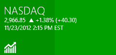
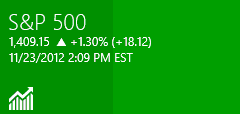

The problem is these screen captures were made at 4:45pm after the market closed. The reports are for 1:06, 2:15 and 2:09. I have no idea why it's displaying prices that are 2 or 3 hours old and all from different times. I have noticed that if you start this App the tile then has current information, at least as of then. I started the App at some point earlier in the afternoon, but how did the tile end up reporting 3 totally different times?
When the Switch List appears (WinKey+Tab, or see above for to coax it out with the mouse) the most recently running App appears at top, the one used prior to that below it, etc. What's weird is that sometimes when you start a new W8 App and then look at the Switch List, the App you just started is not on the list at all, or if you switched back to it it's at the very bottom. Not being on the list at all is a pain, because as far as I know right clicking on it in this list is the only way to "snap" it to the right or left side of the screen.
When you snap a W8 App to a side of the screen, there's a bar between them and documentation claims you can resize them, but as far as I can tell there are only two sizes: a column on either side of the screen and the rest of the screen; or you can un-snap by moving the bar to the edge of the screen. I thought this was Windows?? What happened to any size you wanted, any where you wanted it. Guess that's what the desktop is for ... the W8 UI might be great for small displays, but it's never going to replace the desktop on my larger displays.
Another thing is that if you don't close Apps, but instead open enough that they fall off the bottom of the screen they disappear from the Switch List. As far as I can tell this causes them to close.
This is a bar on the right side of the screen, like the Switch List on the left side. With a mouse you coax it out the same way: go to the top or bottom corner and then slide up or down until it appears.
Microsoft seems to think the Charms are, well charming ... the greatest thing since sliced bread. I've yet to be convinced. The bar has 5 icons for:
Check back. I'm about to start using my new Windows 8 machine as my primary Desktop. That's when I'll discover other programs and/or devices that don't work. The one thing I do know, I'm going to miss Freecell on the Desktop. Guess I'll either learn to like the W8 version or find some other way to waste time.
Suggested next choices: