

|
When asked the question "What do you recommend for a Browser Home Page?", I didn't have an answer. The one I had recommended in the past (my.MyWay.com) had lost so many features that it has become almost useless, so decided it was time to start exploring. Skip this and get to the part about NetVibes My Criteria:
First I tried Yahoo, because I remembered it was customizable. It was OK, but not great, so I asked Google and found this link: Top Personalized Home (Start) Pages I had forgotten about iGoogle, I had setup a page there with multiple tabs, but hadn't used it much. It's much better than it was before. It has a lot more Gadgets than before and I'm currently using it as one of my two Home Page candidates. I recommend you try it. My ObservationsInitially I've decided to experiment with iGoogle and NetVibes. I haven't really explored the others on the list above, there may be better ones (let me know if you have a recommendation). Neither one is a clear winner, so I continue to use both. Compared to NetVibes, iGoogle seems amateurish, both in look and technical details. The iGoogle gadgets are simple boxes, the NetVibes widgets have rounded corners and edges with color and shape. NetVibes has all kinds of details you can customize with it options, iGoogle very few. And as just one example of where iGoogle fails: It seems they've changed the layout at least 3 times in the last year; first tabs where on the top, then on the side, and now they're hidden under a pull-down. In addition to requiring more clicks to get to another tab, hiding the tabs seems to have made it impossible to move gadgets from one tab to another. I blame clue less project managers who listen to feedback from people who say Apple products are easier to use because they're simpler (give you fewer options, or hide the options), so iGoogle has hidden everything under a few pull-downs. If you create a blank page, iGoogle says you can drag and drop gadgets from other tabs onto the new tab, but since they've hidden the tabs it's impossible ... based on feedback I found on Google this bug has existed for 6 months ... amateurish. News feeds on NetVibes are great. They have options to read the whole article from within NetVibes, or by opening a new browser tab to the actual article (which I prefer; that option is called "open article directly on site"). Articles you've already clicked on are dimmed. New articles (since the page was last active) momentarily appear with a bright yellow highlight so you know which feeds new articles have appeared in. Very nice. Both let you customize the look with themes. The problem with NetVibes that keeps it from being my first/only choice are poor widgets in important areas: US Financial Applications (charts, portfolios, etc.), Weather Applications, Comics, etc. Bottom Line: I'm currently using NetVibes for my news feeds and iGoogle for most everything else. Setting up and using NetVibesGo to the NetVibes Site you'll see:
Click on "Sign In" and you'll get:
Next click on "Sign Up". You don't want the premium version, $500 per month is probably a little more than you want to pay. Fill in you username, e-mail address, and password on this form:
There are limits on the characters you can use in your username, maybe only lower case characters, dash and underscore. I think I found the password must be 6 characters or more. And then of course you have to decider and type the weird text and check the I Agree box. Then they'll send you an e-mail to confirm you gave them a valid e-mail address. Once you click on the confirm link in the e-mail you'll see an initial Home Page (they call it a dashboard) which looks like this:
Their quick, 5 step overview:
Add content (widgets) to the page by clicking on the green + sign.
Left click on the bar at the top of a widget, while you continue holding the mouse button down you can drag the widget to another location on the page.
You can add other tabs to the page. For example, so far I've added two tabs to my own page, one with financial news and stock quotes, the other with widgets that only change daily so I only need to go there once a day.
You can also create new pages (dashboards), but I see no reason why you would want to unless you have their premium ($500/month) service.
You can also try what they call the reader view of the page, but I prefer the widget view. The first thing you might want to do is name your page by typing a name like "Wren's Home Page" here:
Personally I don't like wasting all this vertical space, so another choice is to not display the title or the search box. To do this go to settings, an icon at the top that looks like little sliders just to the left of the Dashboards pull-down.
To do this go to the General tab and un-check the Display Page Title and Display Search boxes:
While you're in settings you might also want to customize the look by setting the background and text colors and the wallpaper, or you can choose a "Theme" which sets all of them. Just pick a theme you like and click on it:
This is your page, they've given you some widgets to start with, but don't be afraid to delete them. For example, I don't care about NY Magazine so I just delete it by clicking on the X in a circle at the top right of the widget:
To add content click on the green + sign at the top left, then either type the name of the widget you're looking for or browse by choosing a category. Here I chose news:
But just in the news category there are almost 160,000 widgets (13,289 pages times 12 widgets per page). Use the pull-downs to choose ones appropriate to the US and sort by either recently popular or all time most popular:
The last pull-down also allows you to choose Applications if you're looking for a widget that does something (like display the weather instead of just a news feed that talks about weather). If you hover over the widgets it will show you a short description and how many have installed it. My advice is to avoid widgets that have been installed by less than 100 (1000?) people because someone has just posted them and they might cause trouble.
To install a widget just click on it. Once it appears on your page you can grab the bar at the top and drag it where you want it. In addition to just dragging widgets around on the page to put them where you want them, you can change the layout of a page by clicking on the pull-down arrow next to the tab. You'll then see:
Pick the number of boxes (1-4) you want on the page and then select the layout of the boxes. The boxes will expand vertically to hold the widgets you put in them. Next to the X each widget also has a little gear for changing settings related to that widget. For example, the weather widget initially shows you the weather in Paris (I think NetVibes is a French company) so you probably want to change it to your town:
Here are the options for the weather widget:
Notice the pull-down gives you some display options, and as you highlight each it shows you want it will look like with that options. In this case the Compact option makes the widget a little smaller by showing a four days weather on one line:
|
Sponsored Links:
Sponsored Links: Sponsored Links: Sponsored Links: Sponsored Links: Sponsored Links: Sponsored Links: Sponsored Links: Sponsored Links: |
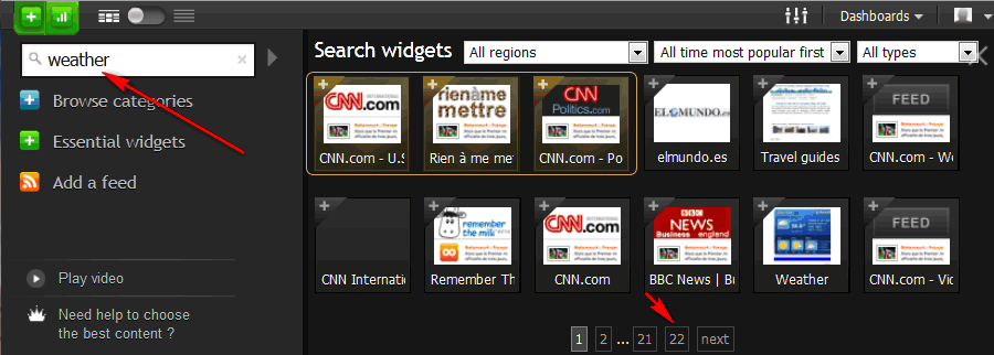
Some widgets, like this one, also have a little down arrow to the left of the settings gear. One of the options is to duplicate the widget. With each copy you make you can show weather from a different city. This widget gets it's information from the Weather Channel. I haven't looked but there might other weather widgets with different sources of information and which will take you to different websites if you click on them. To find out I click on the green + sign, a type Weather and I see there are about 250 different weather widgets (12 widgets on 22 pages):
To narrow down your choices use the pull-downs:
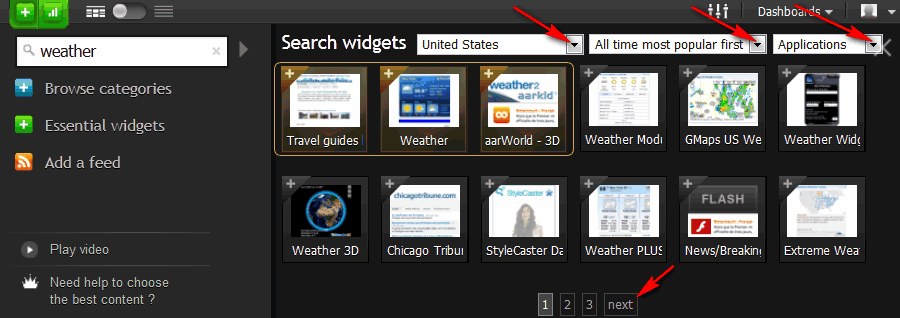
You notice here I limited by choices to Applications. I made a tab just for weather and started to add widgets, but most didn't work. There really weren't any other good choices except the GMaps US Weather, but it's designed for iGoogle. None of the options to customize it that appear in iGoogle appear in NetVibes ... this might be a good reason to use iGoogle instead.
One of the things I really like about NetVibes, in addition to the overall look and customizability, is the way news stories are displayed:
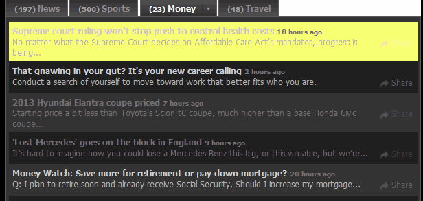
I tend to keep lots of browser windows and tabs open. When I return to a NetVibes window new stories that have just appeared are highlighted, as above, in yellow. I wish I could find a way to toggle this on/off I see what's new in gadgets that are off the screen.
Also note that stories I've already read (or at least clicked on) like the one about the Hyundai Elantra and the Lost Mercedes above, are dimmed so your attention is drawn to stories you haven't read.
I added a Finance tab to my page by clicking on New Tab, typing in the word "Finance" and then clicking on Create (which is like the iGoogle "I feel lucky" option, it adds some gadgets automatically) or clicking on "Create a blank page":

Here's what I got:
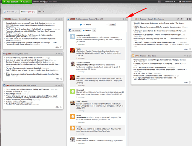
I certainly wasn't interested in everyone who mentioned the word "Finance" on twitter, so immediately deleted that widget by clicking on the X (above). You do get a confirmation so you don't delete widgets by accident:

Next I started adding widgets by clicking on the green + sign (which says Add Content next to it if your browser window is wide enough). Then I decided to browse by clicking on "Business":
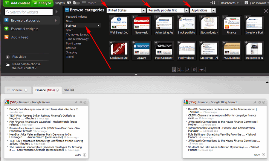
You probably want to also select widgets appropriate to the US, sort by most popular (recently or all-time), and in this case I wanted Applications (not news feeds). I clicked on the first Stock Portfolio widget (the one that says WikInvest on the icon) and got more information about it:
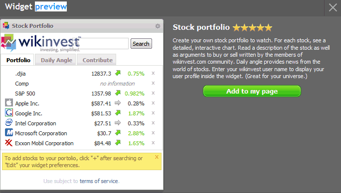
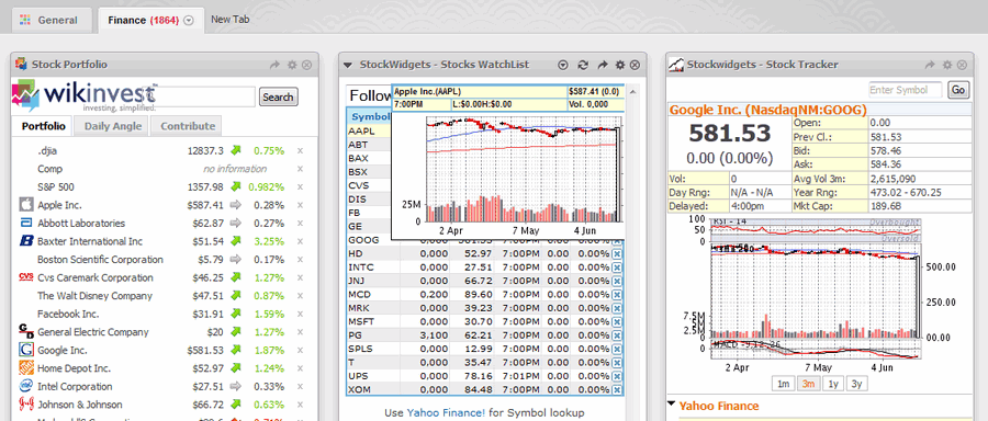
I clicked on the green "Add to my page" button. While I was browsing the business widgets I also added the two Stockwidgets (Watchlist and Tracker) and now my page looks like:
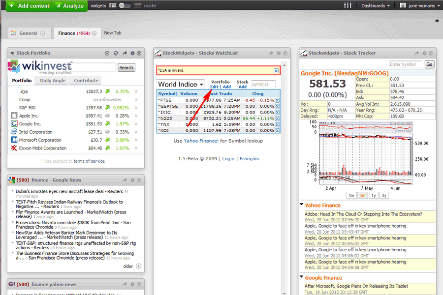
Obviously you need to customize the settings (stocks you want to track, etc.). For more tips on that see my comments on the Finance Tab I added in iGoogle. As I said there these widgets are a bit flaky too and I found you need to refresh the whole page, not just use the refresh button on the WikInvest widget.
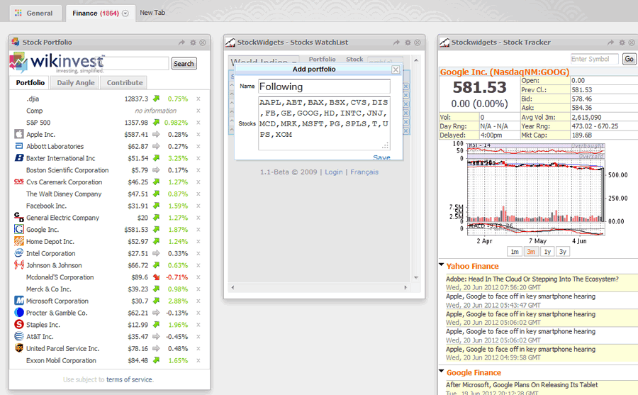
For the WikInvest widget you add stocks using settings. Initially I had trouble, because I didn't know you had to refresh the entire page to see the additions. I think you can leave the Username field blank (or set to NULL). For the StockWidgets Stock Watchlist you need to click on "Add" under the word Portfolio (above), fill in a name for that group of stocks and then enter the symbols (below). As I say in the iGoogle tips, I recommend you keep them in a text file in case they get lost or you need them for another widget.
If you hover over the symbol for a stock you see a graph and other information:
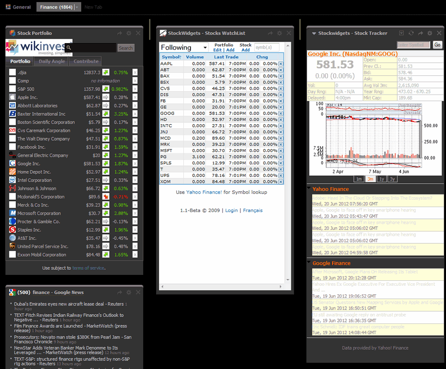
Remember, in both iGoogle and NetVibes you can change the theme for each page. I like the way the red and green percent decreases/increases stand out in the WikInvest widget when I use the Blackmomba theme:
I'm still using both the iGoogle and NetVibes Home Pages (because each has gadgets I like).
Let me know what Home Page you like (there are lots more, see Top Personalized Home (Start) Pages) and also tell me what are your favorite gadgets/widgets.
Both iGoogle and NetVibes have E-mail, Facebook, and other apps which will display updates from other internet sites you use. You might want to check them out (I haven't since I prefer to visit these sites directly.
Check back in a few days, I'll list some recommended widgets.
Suggested next choices:
ImagingTips.com Site Map
[an error occurred while processing this directive]